How do we come up with solutions and make design decisions?
Understanding each design decision in the context of user experience (UX), and taking every special case into consideration are essential.
Trade-offs are unavoidable, and we need to deeply understand user behavior so that we can modify and level up UX by smart design.
Ideation
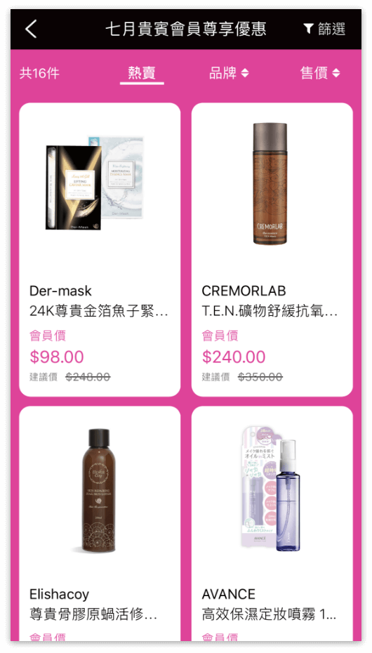
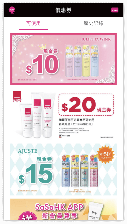
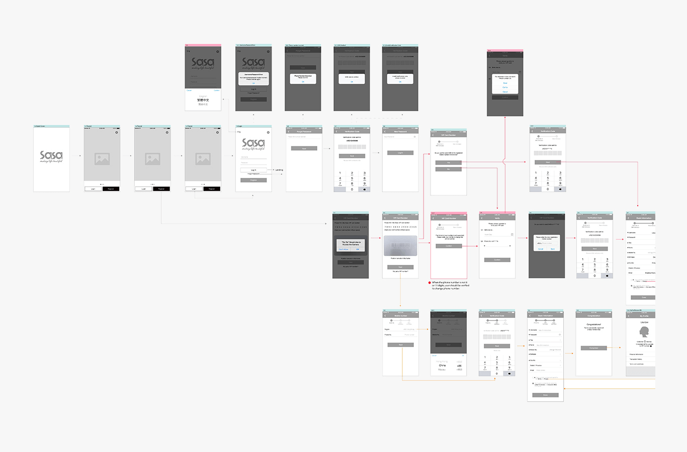
Legato mapped out the entire flow with all entry points and scenarios, and filled it with missing steps. For example, we proposed creating an “E-Coupons” section to replace paper coupons. With it, all updates and available coupons are shown with just a few clicks, in-store shoppers can browse the section and redeem any coupon immediately. Users can review redeemed coupons from the “History” tab included in the section.
Design Solutions
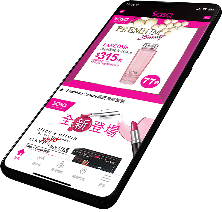
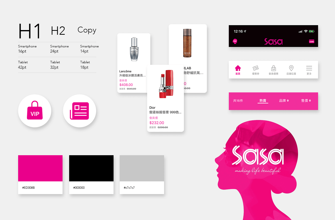
1. Creating an E-Coupons section: We propose adding an “E-Coupons” tab, just next to “Homepage” tab, on the navigation bar.
Our rationale: As for the loyalty program, promotional updates and special offers should be the main content of this app. Therefore, by making “E-Coupons” tab on the navigation bar, users can access privileges more easily.
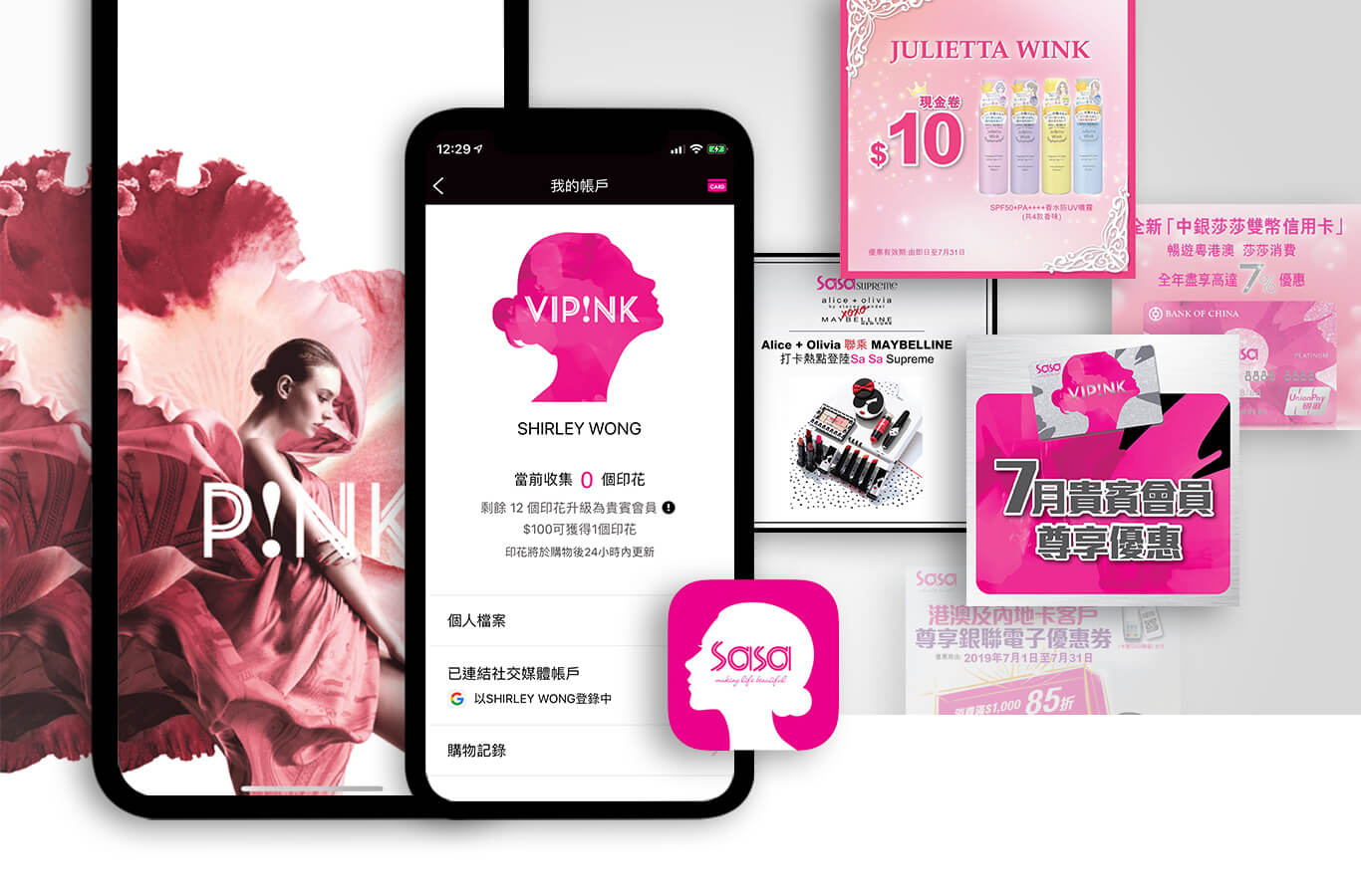
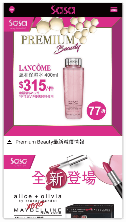
2. Creating a QR-coded VIP Card: A page to show the simulated VIP Card for the QR code scan and point-earning was proposed. We suggested adding the “Card” icon on the right corner of the top toolbar instead of the navigation bar, allowing users to access it from every screen.
Our rationale: Existing VIP customers can always show their simulated VIP card and earn points during checkout rather than searching the “Card” icon from screen to screen.
Challenges Ahead
Changing a person’s habits is one of the biggest challenges we have faced, especially when the app is packed with different features.
For example, would users adapt to the use of the simulated VIP Card for point-earning and E-Coupons redemption?
How do we make each feature easily accessible to users without any hassle?


